LOGO UNRAVEL: THE TOTAL IDENTITY
Some logos make a statement and leave a lasting impression from just a single sight. There is just that distinctive thing about such logos. They have gone a long way to give the brand more visibility and recognition with the passing of time. Well you may be thinking its rocket science, but it’s simply the detailed and quality reasoning behind the logo that makes it stand out. One of those very distinctive and elegant logos is TOTAL’s.
TOTAL is a multinational oil and gas company founded in 1924 in France. It is considered as one of the “Big Six” oil companies in the world. At first the company was known as Compagnie française des pétroles (CFP). In 1954 the company initiated the word TOTAL which represents a brand of gasoline in the African continent and Europe introduced by CFP. Subsequently, in 1991, the company embraced the name TOTAL, making it the identity of its brand as a company.
This officially made TOTAL the flagship name of the prestigious Oil and Gas Company. Since then the brand has continued to enjoy steady recognition and acceptance from both stakeholders and customers all over the world. Hold on tight as we take a deep dive into the TOTAL logo.
LOGO HISTORY
From our research, which formed the basis for articles like Coca Cola and Toyota, so far we have observed that the logos of a good number of brands have evolved overtime. The reason for this sometimes is new logos are created to suit the brand’s new market position at every point in time. This is also the case for prestigious brand, TOTAL.

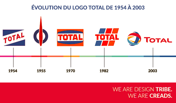
On one July 14 (Bastille Day), the “Super Carburant Total” brand was launched. It was the very first TOTAL logo that made a public appearance. The logo signifies the logo’s French nationality with the name TOTAL written in red letters against a white background between two blue triangles. When marketing operations expanded, TOTAL branded products were then introduced.

In 1955, the logo was transformed to a gas pump like logo. Again, this logo magnified the French theme, with a red flame on a blue circle against a white background.

What followed next was the blue-white-red symbol in 1963. It was soften and relatable and was often referred to as the “soap bar”.

Maintaining three colours, in 1970 the brand again felt the need to redesign its logo to indicate what the brand stood for. The new logo’s colours, the bolder characters and the structure in an horizontal manner expressed the stability and strength, unlike the previous logo with diagonal design indicating the martial spirit of conquest.

1982 saw the birth of a new trademark. It broadened the previous patriotic symbolism of France. The bright red colour represented strength and power while the blue stood for assertiveness and friendliness for the warm orange.
With the same spirit, in 1991-1992, the trademark block was revamped with more energetic lettering. The interior of the logo was made simpler while the rounded edges were replaced with sharper edges indicating a fiercer drive and also brighter colours. The horizontal lines were lighter and the space between letters were reduced and the stripes were narrower. This made the brand more accessible.

Finally in 2003, after a successful merger between PetroFina and Elf Aquitaine, the logo took an entirely new shape different from the previous ones. This new logo gave the brand a new identity which has registered strongly in most minds.
LOGO MEANING
In 2003, as a way of adopting a name that would accommodate the two mergers between TOTAL and FINA in 1999 and TOTALFINA and ELF in 2000, the management decided to go with the TOTAL. This name was strategically chosen as one that would leave a lasting impression on consumers worldwide.
For the Group, the name TOTAL communicates the brand’s wider international visibility and recognition. Following this, a new logo had to be created to also represent what the brand stands for – one of which being the fact that the company pays close attention to the quality of products and services it offers its consumers. The company had to undergo total rebranding from picking a name to designing a new logo, both connecting and sharing the brand’s values.
Unlike the previous logos, the new logo is characterized by spherical elements with different colours. These elements express the company’s universal commitment in the energy field. These spherical elements signify exchanges of energy and human resources which further enhances international social and economic growth.

Defining the logo a bit more, the spherical symbol envelopes the image of multiple energy flows. This represents the different aspect the company deals in from oil, to gas, to electric energy and all other forms of alternative energy, such as solar and wind power. The logo shows the new market position TOTAL has taken as an energy Group and not streamlined to the oil it was known for. It constantly communicates its position as a symbol of energy through its logo.
The logo goes a long way to share TOTAL ideology about energy stating that energy arises not only from primary energy resources, but also from all of its human resources and, in particular, from all of the resources in the sphere of the Group’s industrial and commercial activities.
It can be observed that the TOTAL logo is one crafted by deep thinking which practically represents the brands totally.
Written by Jennifer Chioma Amadi
Want a logo that would increase your brand’s visibility? We’ve got you covered. Send us an email at we care@mapemond.com.
DO BUSINESS BETTER!

