LOGO UNRAVEL: SHELL’S CROWN
The Shell brand started out as a small London business selling antiques, curios and oriental shells. I feel this gave the idea behind the brand’s name and its visual identity system, specifically the logo design because in time the business grew to export these seashells to the Far East and made profit doing so. The first time the word ‘shell’ was cited was in 1891, when it was used by Marcus Samuel and Company (the original founders) as the business trademark in the shipment of kerosene to the Far East. We would not do justice to this article if we skip Shell brand’s influence – also enhanced by its visual identity system -in Nigeria’s oil and gas industry.
The brand’s history in Nigeria began as far back as when oil was first discovered at Oloibiri in the Niger Delta region. In fact, this discovery was made by Shell-BP in 1956. Shell is a major stakeholder in the country’s oil and gas sector with a history of over 50 years of doing business in Nigeria since the late 1930’s. According to Shell on its website,
“For more than 100 years the word Shell, our pectin emblem and distinctive red and yellow colours have visualized the Shell brand and promoted our values and the quality of our products and services all over the world.”
This spells our focus for today’s article – Shell’s logo unravel. There is more to the shell’s emblem than meets the eye especially concerning its essence in promoting shell’s values, product and service quality and visualizing the shell brand globally.
LOGO HISTORY
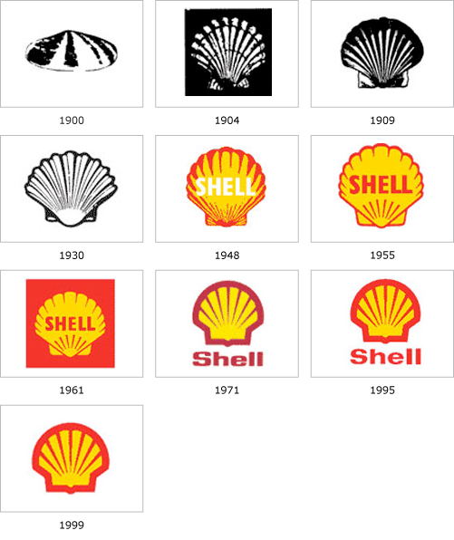
Shell’s first logo was designed in 1901 carrying the symbol of a mussel shell. This happened the third year after the formation of the Shell Transport and Trading Company. Thereafter in 1904, a scallop shell also called the pecten emblem was debuted to give the company a brand name and its visual identity. When the afore-mentioned company formed a merger with the Royal Dutch petroleum company three years later, the former absorbed the pecten symbol and the brand name – Shell. The Logo having the pecten emblem and brand name has been like this since then.

However, the shell emblem has undergone a series of modifications in its design; the emblem design used presently was introduced in 1971. Finally, in 1995, the Shell logo underwent its final modification when the logo colours were dimmed. Prior to this time, its colours were very bright and some felt it made the logo look offensive. Therefore, the present design looks more appealing to the eyes. With over 47 years of great usefulness to the brands visual identity, it has grown to be one of the most popularly recognized logo in the world today.
LOGO COLOUR
The primary colours of the shell logo is red and yellow. These colours were preferred because of their connection to the Spanish flag since many of the people who settled in California migrated from Spain especially because; during Shell’s formative years, California was its central business region. The red colour gives the emblem a colourful look.
LOGO FONT
The font used specifically for the brand name element typography is the Futura Bold typeface.
LOGO MEANING
The logo symbol represents the pecten shell which also names the brand – shell. The logo portrays excellence and brilliance of Shell in the corporate world. In addition to this, the logo emblem apart from symbolizing the Pectin shell, it also takes the shape of a crown; signifying Shell’s position as a leader in the oil and gas Industry.
Written by Rejoice Emmanuel
Are you in need of a well-designed logo that will represent your brand? We are here to deliver good quality. Send us an email at wecare@mapemond.com
DO BUSINESS BETTER!

