LOGO UNRAVEL: AMAZON’S SMILE
Whenever and wherever e-commerce is the subject of discussion, Amazon is one name that would always be mentioned. Without a doubt, it has become an unbeatable name in America and all over the world.
What started out as an online bookstore has grown to encompass the sale of many other items. Its expansion strategy has set it to become one of the world’s leading e-commerce site. Amazon has become a trusted platform for both buyers and sellers who do not hesitate to express their satisfaction with the services rendered.
This air of satisfaction among their clients is one thing Amazon never waste an opportunity to boast about. The attribute of ingenuity in customer’s satisfaction is proudly expressed on the brand’s logo. The simple, yet sophisticated look of the Amazon’s logo now carries with it the story of growth and success of the brand.
LOGO HISTORY
When Jeff Bezos, the founder, established his online bookstore first under the name, “Cadabar” in 1994 and a year later changed to Amazon, the logo did not seem as exciting as it is presently. The initial attempts to brand the company and give it a face was not as remarkable or polished as what we have become accustomed to.
The first logo prototype featured the letter “A” boldly designed as a winding river cutting through its silhouette and superimposed on an aquatic background. Though this logo did not sell the brand completely, still it set the sail for the company.

The blue logo
Subsequently, other variations of the first logo were designed. The other logos were experimented with different colour schemes, icon fills and choices of typography. In 1997, the wordmark had extracted the capital “A” icon. This version of the logo had both upper and lowercase.

Other variations of the logo
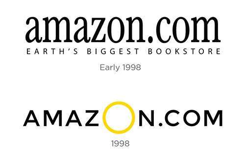
Amazon took a new direction in 1998 because of its exponential growth. As part of the revolution, the company had to redefine its identity to differentiate it from other online shopping platforms and make it stand out in its industry. Amazon was one of the first e-commerce sites to incorporate one-click shopping and email order verification. The company’s services provided convenience for shoppers with a comprehensive stock of books.
This successful phase extended the company’s model to include an audio library. With over 125,000 titles searchable by artist, song title and label, the music section would debut on Amazon. Following the expansion, there were a series of iterations on the logo to suit the rapid growth of the company.

The letter logo
The iterations would include a lowercase serif logo paired with a book and globe icon. With the future in view, the company’s ambitions were reflected in its new tagline “Books, Music & More” This logo would remain in place until the company had time to expand on the “More” part of the vision. Due to the diversity of the company, more changes were made; this included a sans serif, all-caps wordmark with a large, golden “O” in the middle. This version lasted for only a few months before being redesigned into the sans-serif, lowercase font.

In 2000, Amazon was gaining more visibility but rather than be complacent, Jeff Bezos constantly sought for ways to improve the company while exploring innovative ideas. The company gradually transited from consumable media into almost every product in the planet. To mark this new feat, Bezos desired a new logo – a timeless one that would bear the company’s message. To achieve this, he implored the help of Turner Duckworth, a creative agency that gave the company’s identity a tremendous facelift.

The present logo
LOGO MEANING
The current emblem came with new success; with the swooping yellow arrow that points from the “a” to the “z” of the logo, which explained the founder’s original plan for Amazon. The shape of the arrow has a round-edged, organic quality, and the right side bends the bottom stem of the “z” upwards. This symbolises a smile to represent the stellar customer experience the company is known for.
Apart from the smile interpretation of the logo, the arrow from “a” to “z” also means that Amazon sell everything from a to z. That is, almost every product can be found on the Amazon store.
LOGO FONT
The Amazon element is designed with a custom font, which resembles Officina Sans. This font gives the wordmark “amazon” a bold face. The well-crafted wordmark has become a recognisable identifier related to the brand.
LOGO IMPACT
Amazon’s logo with no word said, spreads the message behind the brand. At just a glance, it sends signals to each viewer.
The logo also serves as a reminder to both clients and staff. For clients they are assured of having a stress free customer experience whenever they make purchase on the Amazon site, which eventually leaves a smile of satisfaction on their faces. On the other hand, the staff are reminded that they have to ensure that every service or product meets the customer’s taste and satisfy them.

Amazon remains a leader in its industry, a timeless brand, and continues to evolve. From online retail, with everything from ebook readers, to delivery via drones and terrific automated hub that manages its ever-growing inventory of products. The company has never conformed to the norm and has always tied its progress and innovation to its logo and collective ethos that was inspired by the founder.
Quoting Bezos;
“We are culturally pioneers. We like to disrupt even our own business. Other companies have different cultures and sometimes do not like to do that. Our job is to bring those industries along.”
Written by Jennifer Chioma Amadi
Do you need a logo? we can help you design one for your brand. Reach out to us at wecare@mapemond.com
Do Business Better!

