LOGO UNRAVEL: LIFE’S GOOD
Think of a brand with the most soothing effect to its presentation– you know that brand whose slogan and appearance ignites hope and reassures you of a better future. It will be surprising if your mind does not get a light bulb with LG as the centre of attraction.
With its simple design and that timeless slogan, “Life’s Good” to complement its quality products and services, LG remains one of the most remarkable brands that has ever existed. It has effortlessly created a memorable icon and earned itself worldwide recognition. This has qualified it for our logo unravel this week.
LOGO HISTORY
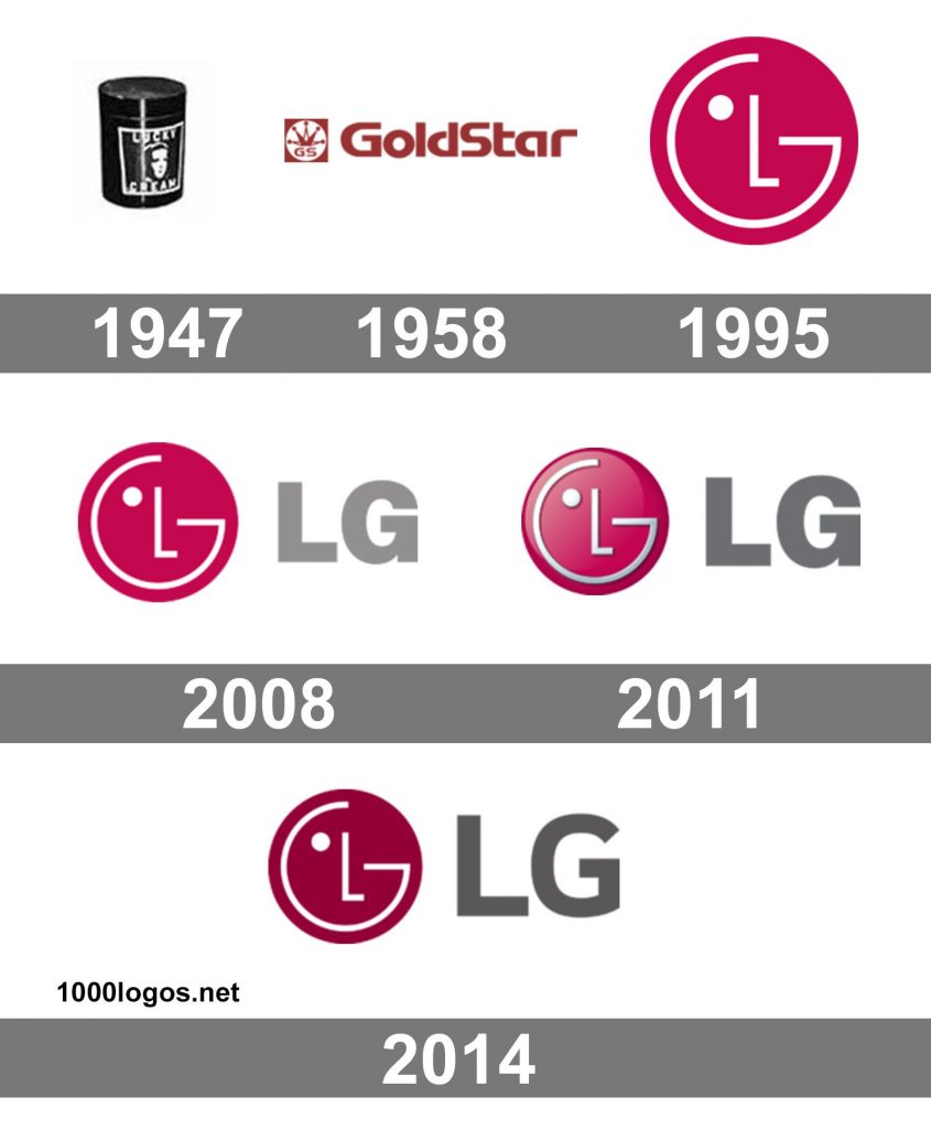
What we know as LG started with the name Lak-Hui Chemical Industrial Corp in 1947. The company’s main focus then was plastic products. In 1958 the name was changed to Goldstar Electronics and later Lucky-Goldstar, which was a combination of two businesses. Though the company’s focus had shifted to electronics production, it continued to produce plastics and chemicals as well.
The brand which sprang from the shores of South Korea made history as the first company to produce the first radio in South Korea. Today it has become known for production and distribution of electronic products used in several parts of the world.
In 1995 the company created a new brand identity, LG, which set it on a whole new pedestal. It was at this time the logo and the company slogan was revamped. The company’s aim was to convey all of their brand attributes with one colour, two letters and the simple shape. The logo and slogan literally represents what the brand stands for.
LOGO MEANING
The company’s identity revolves around two letters ‘L’ and ‘G’ that corresponds with its slogan, “Life’s Good”. The logo represent the pillars upon which the company was founded on “Global, Tomorrow (Future), Energy, Humanity and Technology”. The letters L and G fixed inside a red circle interprets the company’s main ideal, humanity.
The icon signifies the company’s resolve to create a lasting relationship with their customers, ensuring that they achieve the highest satisfaction. The logo is designed in such a way that the G looks like an on-button showing that the company is an electronic company. Also the combination of all the elements in the red circle has an effect of a smiling human face.
The logo was given a 3D transformation which was an intentional act by the company to give it a futuristic appeal. In their words,
“strengthen the visual impact of our symbol mark and help communicate our attributes.”
LOGO COLOUR
The LG logo colour consist of three elements in its colour scheme- the brightest colour is the dark shade of red that is referred to as “the unique LG Red colour”. This colour represents friendliness and the brand’s commitment to deliver the best.
A closer look inside the red circle, the company’s name is stylised in white. There is also a customised grey colour used for the characters next to the logo. The shade of grey used is usually darker but in recent times a lighter version is being used.
LOGO FONT
The original LG logo used the Helvetica Black font. The company gave its wordmark a facelift in 2015 that gave the letters in the red circle look larger but slimmer and more readable.
Written by Jennifer Chioma Amadi
Do you need a brand identity? We are your guys! Send us an email at wecare@mapemond.com
Do Business Better!

