LOGO UNRAVEL: THE AIRTEL WAVE
There are only a few logos in the world that have a futuristic feel to their design. These set of logos are not only remarkable but are timeless and ever refreshing to behold. They continue to effectively communicate the brand’s core values with ease. One of such exceptional logos is Airtel’s.
From a rather complicated identity, Airtel transformed to a more defined emblem referred to as the ‘Airtel Wave’. Through this logo, the brand has gained retention and recognition since the symbol is one that can hardly be forgotten. Stick around longer to find out the meaning behind the Airtel logo.
LOGO HISTORY
Founded by an Indian entrepreneur, Sunil Bharti Mittal, in 1984, as a small mobile network provider, Airtel has since then enlarged its territory to many countries. It is regarded as the fifth largest mobile network in the world with over 386 million subscribers.
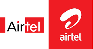
At the beginning of its journey, Airtel used a plain logo that didn’t exactly communicate the brand easily to its customers. The logo was a blend of many colours and the word Airtel was divided into two sections, ‘Air’ and ‘Tel’. The former was written in black on a white background while the latter was written in white on a red background which was sometimes accompanied by the slogan, “Express Yourself”.

During a thorough rebranding of the company in 2010, Airtel introduced a new identity that showed the brand’s repositioning. To get a name for the new logo, the company initiated an online contest for customers to suggest the best name. Among all the name suggestions, ‘Wave’ stood out and was adopted as the logo’s name. The company interpreted ‘Wave’ as a switch to “Dil jo chahe paas laye” which meant the brand’s communication on air. It also indicated the company’s continuous effort towards innovation.

The current logo which resembles a curved ‘a’ which is highlighted to indicate dynamism, warmness and friendliness, was designed by London-based brand agency, Brand Union. According to the company, the emblem symbolises a force of energy that draws the management and customers closer. The modified Airtel logo represented a symbol for humility which customers could find relatable.
LOGO MEANING

The stylishly curved “a” known as the Airtel Wave is the basic idea behind the brand’s identity. The “Wave” represents the swift changes that the brand regularly offers its customers and shows the futuristic side of the brand.
According to the company, “Our unique symbol is an interpretation of the ‘a’ in Airtel. The curved shape and the gentle highlights on the red colour make it warm and inviting, almost as if it were a living object. It represents a dynamic force of unparalleled energy that brings us and our customers closer. Our specially designed logo type is modern, vibrant and friendly. It signals our resolve to be accessible, while the use of all lowercase is our recognition for the need for humility.”
LOGO COLOUR
Red is one colour that the company has stuck with over the years despite the changes that may have occurred. To the company, red interprets passion, energy, and dynamism. Unlike the previous logo that had a mix of colours, the current Airtel icon is simple and easier to remember.
Here is the company’s opinion about the predominant colour;
“Red is part of our heritage. It is the colour of energy and passion that expresses the dynamism that has made Airtel the success it is today, in India, and now on the global stage.”
LOGO FONT

A unique typeface that has an appealing visual harmony with the wave element was used in designing the logo. The lines that formed the letters that spelt the word “Airtel” were carefully designed in order to give it the special effect.
Written by Jennifer Chioma Amadi
Do you need a unique logo? We’ve got you covered. Send us an email at wecare@mapemond.com
Do Business Better!

