
In a small town in Michigan, two brothers, Tom and James Monaghan, started a small pizza joint in 1960. The Monaghan brothers dedicated their time, putting out the best kinds of pizzas, which in no time spread to more people than they could imagine. Today that little venture has grown to become one of the largest pizza chain in the world.
Asides from the distinctive variety of pizza Domino’s produces, a major ingredient that has brought more fame to the company is its logo. The brand’s logo has travelled far and near, telling the brand story everywhere. It keeps drawing the attention of prospective customers while it serves as a reminder to existing customers. Knowing the recognition Dominos’ logo has globally, it is worth knowing what makes it different.
LOGO HISTORY
Domino’s first logo was designed in the 1960’s. The logo was created in a bid to attract customers with its bright colours, white, red, and blue, which had an appealing feel. This logo featured two dominos placed horizontally one above the other. Inscribed on the dominos below was “Domino’s Pizza” while the top one had three dots. The three dots symbolised the three stores the brand had at the time. The initial plan was to add a dot whenever a new outlet was opened. This idea obviously could not work since the company expanded beyond the founders’ imagination.
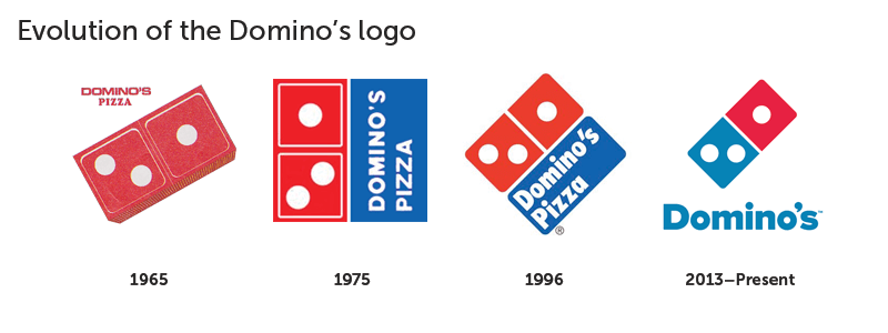
In 1975, Domino’s made a few changes on its logo. The change was focused on making the colours of the logo more attractive and communicate to different people everywhere they see it. With just a simple flip of the logo, brought more visibility to the company. The two dominos, coloured in red, were kept on one side while the slogan was placed beside them.
The company felt the need for another design in 1996. This time the emblem was rotated on its side, a change was made on the typeface, and the colours were made brighter, and there were also a couple of other subtle modifications.

A rework was done on the logo in 2012. The dominos icon was retained while the slogan was readjusted with the removal of the word, “Pizza”. This new logo indicated the level of growth and influence of the brand. Since the brand had established itself and has become known for its pizza, there was no need including “pizza” in the logo anymore.
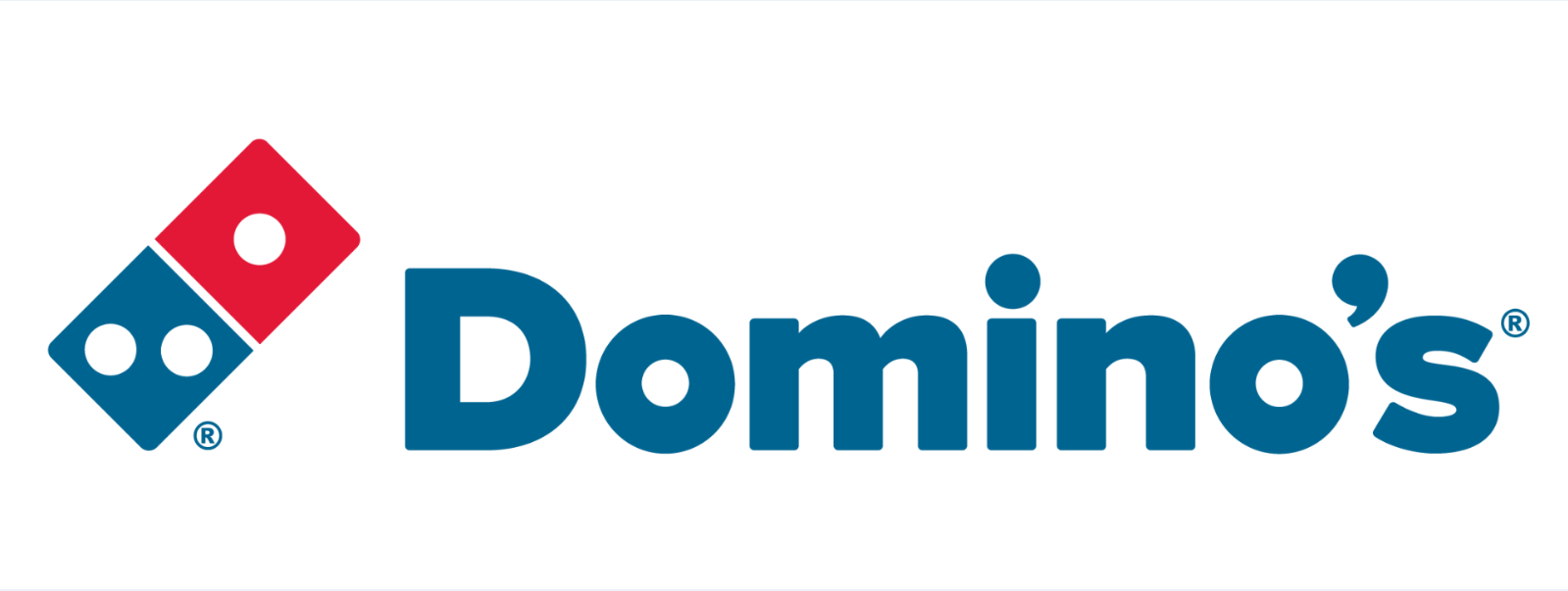
The current logo

LOGO COLOURS
There were no much changes made in terms of the colour selection from the creation of the logo. However, there has been several adjustments in the shades of the chosen colours, red, white and blue. The idea has always been, to attract more customers through the logo.
LOGO FONT
The present typeface is a version of the Pluto Sans Heavy type created by Hannes von Dohren while the first logo designed in 1996, used a typeface that resembled Futura Condensed ExtraBold.
LOGO IMPACT
Domino’s logo is one of the most effective logos. Before the word pizza was removed from the logo, the logo served two clear purposes, drawing the attention of customers and communicating what the brand does. The company’s name and its logo has become a popular identity in US and all over the world. The Domino’s logo is known for its staying power.
Written by Jennifer Chioma Amadi
Do you need a logo that is integral to your brand? We are your guys! Send us an email at wecare@mapemond.com
Do Business Better!