

Hardly would you find an athlete who is not familiar with the swoosh symbol. The trademark is virtually on every sport attire you think of. Over the years, that simple but stylish Swoosh symbol has become Nike’s identity and has added to its fame.
Wondered how Nike, the American athletic brand, gained so much recognition and increased its worth? Let us do some unravelling.
LOGO HISTORY
Many would say that the creation of Nike in January 25 1964 by Bill Bowerman and Phil Knight, brought about a revolution in the sport industry. The company first ran with the name, Blue Ribbon Sports (BRS) until May 30, 1971 when it changed to Nike Inc. As part of their rebranding plans, the company began to make use of the Swoosh emblem.
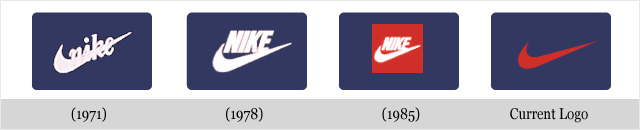
The famous Swoosh logo was craftly designed by Carolyn Davidson in 1971. At the time, Davidson was a graphic design student at Portland State University. She had met Phil Knight who was teaching accounting at the same university. Knight wanted a stripe-like design that would not look like that of its competitors. Davidson designed several marks before the final mark, which symbolises motion.
Since its creation, the Swoosh has gone through only a few changes. The most popular version is the solo swoosh but most often, the emblem is used alongside the brand name, Nike. The logo is used mostly in red and white colour palette and more recently, black.

Since 1988, the Swoosh has been accompanied by the brand’s famous tagline, “Just Do It”. Both the Swoosh and the tagline together communicate the brand’s values and belief. As a major marketing strategy, the brand uses high profile athletes to advertise its products.
LOGO MEANING
The common meaning of the Swoosh is that it communicates motion and speed. However, beneath the simple design lies a deeper meaning because it symbolises the wing of the known Greek goddess of victory, Nike.
LOGO COLOURS
Though the logo initially appeared in different colours in a means to be distinguished from other brands, subsequently some primary colours were chosen. The most popular colours used are red and white colour palette. While the red colour indicates passion, energy and joy, the white colour denotes nobility, charm and purity. In recent times, the black colour palette was introduced.
LOGO FONT
In 1994, the brand’s name NIKE was written in an all caps Futura Bold font along with the Swoosh symbol. In the preceding years, the brand utilised only the Swoosh emblem as its corporate identity.
LOGO IMPACT
Due to its simple design that is easily recognisable, Nike’s logo automatically stands out from the crowd. It is listed as one of the most successful and high quality brands in the world. During advertisement, the brand consistently shares its message through its logo. To gain more popularity and dominance, Nike uses the Swoosh logo in endorsing great athletes. So whenever one thinks of Nike, they think of victory.
DID YOU KNOW…
- Nike is the winged goddess of victory in Greek mythology, who sat at the side of Zeus in Olympus.
- The Nike logo cost a total of $35 to be designed by Carolyn Davidson in 1971
Written by Jennifer Chioma Amadi
Do you want a creative logo design? We design beautiful logos! Send us an email at wecare@mapemond.com
Do Business Better!