LOGO UNRAVEL: MICROSOFT’S COLOURFUL WINDOWS
What’s a computer without a Microsoft software? That’s a bit hard to imagine, isn’t it? Think about it, virtually every computer is operated with the help of Microsoft products from the Windows Operating System to other easily accessible software that give users a better experience.
Now if almost all computers come with Microsoft products installed in them, it invariably means its logo is also imprinted in them making it one of the most recognised brands in the software industry. This way it has gained massive visibility and relevance.
The Microsoft logo is one which has communicated the brand’s message over the years and has left a lasting impression on its customers. With a minute glance at the Microsoft emblem, most people instantly recall what the brand stands. Speak about logo impact!
Today we decided to slide the Microsoft Windows to get a clearer view of how it has evolved since its inception.
HISTORY OF LOGO
From the onset, Microsoft established itself as one of the most creative software brands. Its exceptional operating system, Windows, and the line-up of Office software products, the company created a brand that will last in the minds of people all over the world. For many decades, Microsoft has consistently been a part of businesses, system
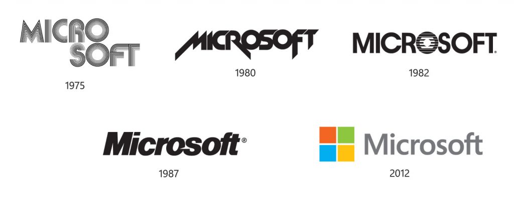
Logo Transformation from 1975-2012

1975
The founder, Bill Gates and his cofounder, Paul Allen, designed the company’s first logo in 1975. They created this version using a programming language to draw concentric lines and rounded edges that forms an all cap. This logo, which was inspired by a disco aesthetic, served its purpose for the time but the company needed something more radical to represent its brand.

After a few years, in 1980, the logo was recreated to suit the partnership between Microsoft and IBM. The aim for creating this logo that had sharp edges, diagonal lines and exaggerated stems concentrated on the letters M, R and F, was to retain the company’s visual relevance, making it bolder and more appealing to the new market. In no time, the new logo gained its popularity among computer enthusiasts and programmers.
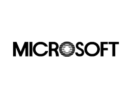
In a bid to increase the brand’s awareness, the previous logo was changed again in 1982 to a solid, geometric sans-serif font. For this particular logo, more details was added to the letter ‘O’ with series of parallel lines drawn inside which represented an icon known as the “blibbet” by the employees. This logo gradually became the face of Microsoft’s flagship brand, Windows operating system.
The blibbet also served as a standalone logo, which was used as a watermark on the company’s stationery. This particular logo made a reasonable impact on the employees and alumni of Microsoft academy. Larry Osterman, the lead engineer, stated that there was even a customised Blibbet Burger on the Microsoft’s campus, and a campaign was organised by employees, and current CTO, Dave Norris, to “Save the Blibbet” when a new logo was proposed in 1987.

With Windows operating system becoming a recognised brand worldwide, there arose another need to revamp the logo. Following this, Scott Baker, the in-house designer was given the responsibility to refresh the logo to something that would better represent the company’s goals and vision in the new era. Narrating the meaning of the new logo, Scott said;
“The former logo, the ‘Blibbet’, was more in keeping with how we saw our company five years ago. The new logo, in Helvetica italic typeface, has a slash between the “o” and “s” to emphasize the “soft” part of the name and convey motion and speed.”
This logo, a bolder title- cased wordmark, was used to represent the transition of the brand from the old era to the new one. The triangular silver carved between the ‘O’ and the ‘S’ had slight similarities with the Pac Man logo and this eventually earned it the title “Pac Man Logo” given to it by the employees. The logo was used for a period of 25 years until the year 2012 when another logo was introduced.

Having observed that all the previous logos never really presented the company’s major product, Windows, the in-house designers were tasked collectively to brainstorm for a new logo. Finally, on the 23rd of August 2012 the present logo was launched. This new vibrant logo consist of the wordmark written with a new font and an emblem with four colourful squares. This logo was designed to represent the company’s known products; the red for Office applications, green for Excel, blue for Word and yellow for Outlook. In addition, the Microsoft uses its own typeface, Segoe UI, which was created by the designer, Steve Matteson. Asides being used for the company’s marketing and designs, it is used within the operating system and software for mobiles and desktops.
According to Microsoft:
“The brand should evolve to visually accentuate this new beginning, as the company prepares for the launch of its new products. The logo takes its inspiration from our product design principles while drawing upon the heritage of our brand value, fonts and colors.”
MEANING OF LOGO
The icon symbolizes the Windows system. The logo simply feature a window with four panes of different colours, red, green, blue and yellow. This window version of the logo moved from the flying windows to a static one.
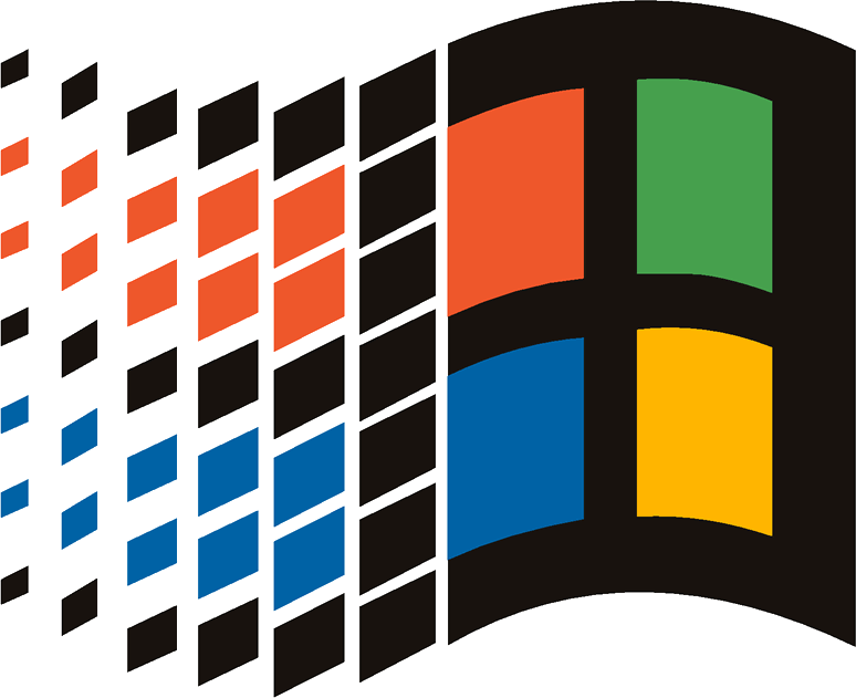
The logo also emphasises the company’s innovation in technology, which it offers people daily. The company continues to include new technological features in order to improve customer experience. The Microsoft logo stands as a symbol of quality in an operating system that allows people explore the world of technology through its Windows.
According to the general manager, Jeff Hansen, the logo signals the heritage and the future- a newness and freshness.
THE ICONS
In 1995, the first Microsoft Office logo was introduced which featured a wordmark, and a square shape. When the XP version was introduced, in 2001, a gradient tool was applied to the logo. After the 2012 emblem was released, it became an abstract orange shape, which was supposed to reflect the company’s new design language.

The earlier Microsoft Excel logo featured the letter “X” that had the “L” on one of its sides that could be read as “XL,” or, Excel. From 1985 to 2013, the logo was modified eight times but retained the same visual effect. Finally, in 2013 variation, the logo was changed to just “X”.

The first Microsoft Word logo was designed in 1983. It was then just a wordmark with a recognizable “O” character but after four years a new emblem was adopted which featured the character “W” instead. The new logo was positioned in a way it looked like a sheet of paper. The same idea was recycled over the following years until in 2000 when a new logo was introduced. It had character, “W” craved in a square shape with the colours white and blue. After several other modifications, the company designed the open book with the letter “W” on the cover in 2013.
LOGO FONT

LOGO COLOURS
The Microsoft logo consist of six colours; the grey wordmark and the blue, yellow, green, and red or orange emblem, which are all on a white background.
The colours are a representative of a division or product line of the corporation.
The light blue colour stand for the Word or most times the Windows, which is the ‘background’ of everything one does on the PC. The blue colour also is a cool and slick colour, and symbolises Microsoft’s vision for Windows which to be slick and quick, and still be cool and easy to use.
The orange/red colour stands for Microsoft’s Office products. Red means business and suggests busy and productive which is what Office does, to get things done.
The green colour stands for Microsoft Gaming, mainly XBox. Green is a fun colour, which is what Xbox was designed for.
The yellow colour stands for Microsoft Hardware. Yellow is a bold and strong colour meaning that Microsoft hardware is built to be durable and efficient.
As seen above, at every stage of its evolution, Microsoft has always tried to communicate its brand values though it visual identity which reflects a part of its brand strategy. This is the reason why the Windows of Microsoft will always be one which attracts the freshest air of new ideas.
Written by Jennifer Chioma Amadi.
Are you in need of a classic logo that tells the story of your brand? We are one email away to help. Send us an email at wecare@mapemond.com
DO BUSINESS BETTER!

