
Like the sun, Oando’s logo streams its rays that emits an irresistible energy to all its customers. The blend of oval shapes of different colours and sizes has become its signature identity recognised all over. It is easy to tell that the company doesn’t just focus on distributing their products and services but also aims to create long lasting impressions.
Though Oando is an indigenous Oil and Gas Company based in Nigeria, it started out as a petroleum marketing company in 1956 and operated with the name Esso West Africa Incorporated that is a subsidiary of Exxon Corporated of the USA. Ever since, the company has evolved to become one of the largest energy brand in Africa.
The Oando brand has been through numerous rebranding stages from acquisitions to mergers. It is one brand that has experienced and survived many difficult times. Even though it has made tremendous impact in the Nigerian oil and gas sector, the company still works with a view of emerging as a world class brand.
The prestigious brand is known for its bold spirit towards the quest to succeed, the quality of its leadership and its well dug African root. It has consistently communicated its beliefs and values through every medium it has at its disposal. One of the medium it leverages to pass its brand’s message across is its outstanding logo.
LOGO MEANING
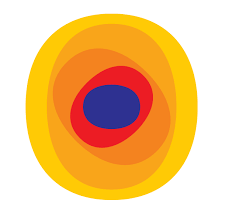
The logo, which resembles the sun, symbolises warmth and the dawning of a new era for the organization. The oval shaped elements in various sizes encapsulates the company’s continuous expansion and growth. The elements also expresses the brand’s basic principles of vision, focus, and unity. The different angles of the oval shapes is an impression of movement–movement forward, movement to the future, and the movement of energy.
LOGO COLOUR
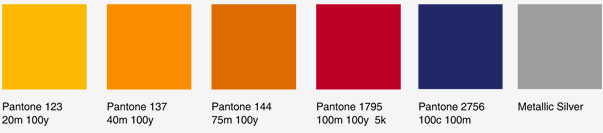
The company’s corporate colour palette was carefully and deliberately selected to uphold the image and energy that forms its identity. The brand ensures that the colour range and graphic elements remain consistent for all their official use as this has become their corporate signature. The consistency in the colour system is applied in order to establish a distinctive visual language and expression for the brand.
LOGO FONT

The wordmark is written in Helvetica. This font was chosen for its clean feel and readability, and its honest, open and approachable appeal. The font aligns with the brand’s simplicity, clarity and boldness. Also Helvetica is a contemporary and timeless character which secures the brand’s relevance.
Written by Jennifer Chioma Amadi
Do you want a logo? We can help you design the best! Reach out to us at wecare@mapemond.com
Do Business Better!