LOGO UNRAVEL: STERLING BANK’S RISING SUN
From what looks like a rocket heading to the moon inside a red circle, to what has now been redesigned to represent a rising sun still inside a red circle, Sterling Bank is certainly on the move to something new. Through their different branding approaches, it could be perceived that they are on a mission to increase their visibility and customer base. With proper observation, this branding strategy seems to be working for them as they have gotten more people engaged on their social media platform and a lot of new accounts being opened.
THE LOGO TRANSITION
Sterling Bank, usually referred to as the one-customer bank, has travelled for as long as fifty eight years in the banking industry but recently felt it was time to change the strategic position of their brand. The bank which was founded in the year 1960 as the First Merchant Bank has continued to evolve over the years to becoming one of the fastest growing commercial banks in Nigeria. In recent times, one of the evolutions the bank has undergone is the revamping of their logo.

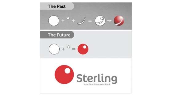
The old logo showed their previous brand position which was “aiming for the moon”. This concept was associated to their desire to reach the stars and it reflected in the type of services they rendered to their customers, their values and the brand disposition in general.
DEFINITION OF THE NEW LOGO
Contrary to the old logo, the new Sterling bank logo took a new dimension. They say their new logo represents the evolution of their new identity as “The Rising Sun”. This, they reported to mean the alignment of their brand to the current strategic positioning of the bank.

The new logo which has now become their identity is said to reflect their progression from the traditional banking to a new and agile force that delivers forward-moving disruptive solutions.
This is what has informed their journey from the previous “aiming for the moon” to the present “The Rising Sun”. Also for them, this means growth. This could be observed in their leverage on technology and delivery of some of the most innovative and market-disruptive solutions. Some of the solutions they have provided include; Specta- Nigeria’s fastest consumer lending platform, FarePayB- Africa’s 1st contactless Transport Card, and I-Invest- World’s Mobile 1st Treasury Bill App.
BRAND VISIBILITY
Asides the buzz Sterling Bank ignited on social media about their new logo, the bank went further to make their new logo more visible by partnering ride hailing services like Taxify and Uber. They branded some of the vehicles which can be seen on various roads, silently putting the bank’s identity in the minds of consumers.

Due to this strategic move, Sterling Bank seems to be stronger, in their word “agile”, more innovative and relevant to their customers. With their visibility and new brand position, they are definitely giving other banks a run for their customers.
Although, in brand sense, the concept of a new identity is a welcomed development, the concern remains, will Sterling Bank be able to maintain this new position and deliver as much as they have promised. Like we educate people all the time, branding goes beyond logo designs and outward appearance. Nevertheless, we hope they get it right,
Want to grow a sustainable brand? Reach out to us at wecare@mapemond.com
This year, “do business better”
Share your thoughts with us, leave a comment.
Written by Jennifer Chioma Amadi

