LOGO UNRAVEL: The Coca-Cola Script
Logos have always been a vital part of a brand. They gradually become the company’s identity as time goes on. Deciding on an emblem that would represent your company could be quite a daunting job and would sometimes go through several refining process before getting the final piece.
Even after the final craft is done, it continues to undergo reviews from time to time. This has been the case for the oldest drink of all time, Coca-Cola. Tag along as we take a ride through time from how the famous brand got its logo and how well it has represented the brand so far.
Logo History
For a brand that has journeyed for 130years, Coca-Cola has gone beyond being a mere brand to becoming a legend. Without a doubt it has become one of the most prominent drinks accepted all over the world. Nonetheless this great brand has been through many transformations from the shape of its bottle, to its CEOs and also its logo. For the purpose of this article, we will dwell on the logo transformations.
Though the Coca-Cola brand has been recognised worldwide for its outstanding logo which is simply the combination of two words, “Coca” and “Cola”, it will be interesting to know that the logo has been modified severally. Its famous name was given to it in 8 May 1886 by Frank M. Robinson who happened to be Dr John S Pemberton’s bookkeeper.
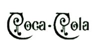
Frank M Robinson felt the blend of the two “C”s would be good in terms of advertising the product. Robinson’s idea worked exactly as planned and the logo gradually became easily recognisable by consumers.
Logo Transition
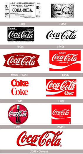
The Coca-Cola logo was first scripted by Frank M. Robinson in 1886. It was written in a popular writing style called Spencerian. Since then the logo has undergone series of changes and may continue to transform as the years go by.
The following year being 1887, a slight touch was added to the logo. The words “Trade Mark” were added to the tail of the first ‘C’.
Moving on to 1890, the logo was redesigned with extra swirls added which made it a bit dramatic. This little twist gave the logo a face lift.
The logo further transited in 1914 to gain a new identity. In this new logo the words “Trademark Registered” was written below.
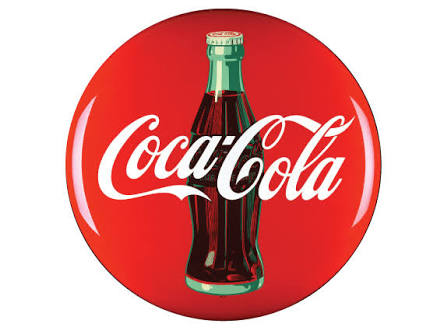
In 1947 a red disc shape version of the logo was used to advertise the brand and afterwards became an outdoor signage. This red disc images were strategically used to decorate business places to boost advertisement.
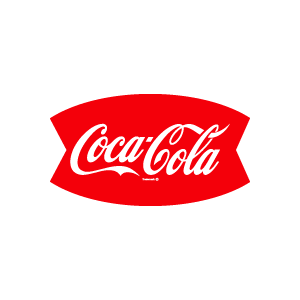
The next form the logo took in 1958 was a fishy shape. The script was inserted in an Arciform shape which was similar to an arch. The Arciform sign is also known as the Fishtail sign. This design was used as the company’s identity and was used in copy, signage and on vending machines.
The logo took a wavy appearance in 1969. The Coca-Cola script was now underlined with a white wave design also known as Dynamic Ribbon Device.
In 1982 the logo was redesigned to a slab serif font. This happened exactly when Diet coke was introduced to the market. Also in that year slogans such as “Coke is it” was used.
2003 came with a new feel to the Dynamic Ribbon Device as some touch of yellow and some bubbles were added to the logo.
While in 2007 the logo was made simpler and bolder with just a touch of a white ribbon added to it.
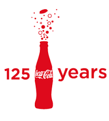
To celebrate the brand’s 125years birthday in 2011, the logo was modified with bubbles bursting from the contour bottle. This was used to describe a celebration of the different seasons, past, present and future, the brand has gone through.
In 2013, to promote a campaign called “Share a Coke”, the logo was again adjusted. The Coca-Cola logo was replaced with a typeface was named “You”. This was a marketing strategy to connect with the consumers better.
It was the first time the company’s packaging changed. Gradually it evolved with different names customised on the bottles.
Finally in 2016, with the theme “Taste the Feeling”, a synergy was created for all the products of the brand. This campaign initiated “One Brand” for all Coca-Cola’s flavours from Coca-Cola Classic, Diet Coke, Coke Zero and Coke with Stevia.
The new logo design united all the flavours under the classic Red Disc and also brought about the use of the contour glass bottle. The idea behind the new design was to indicate that no matter how different the flavours may be, they are all under the main Coca-Cola brand.
Logo Colour
The regular colours used in most of Coca-Cola’s logo and products are red and white. These two are applied to simplify the designs and appeal to the eyes of customers. There is also a welcoming feel to it.
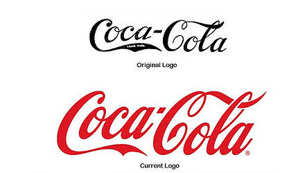
The red colour is also used to represent the brand’s powerful marketing position. Little wonder why it has remained a giant in its field.
Written by Jennifer Chioma Amadi
Does your company have a known identity? We can help you create one that stands out. Reach out to us via email at wecare@mapemond.com
#DoBusinessBetter

