LOGO UNRAVEL: THE SPAR FIR
One of the most visited places in the city of Port Harcourt is SPAR. During the last festive season, there was a frightening mammoth crowd pressing in at the mall’s entry point, insistent on patronizing their services and products. It won’t be far-fetched to assume that 5 out of 100 persons in Port Harcourt patronized SPAR last Christmas. The building itself was crammed up with all caliber of people similar to the scenario as was reported in various SPAR outlets within the country. This shows the popularity and far reaching effects this brand has on its customers. In fact, it is now a household name in Nigeria, found on the lips of many regular shoppers.
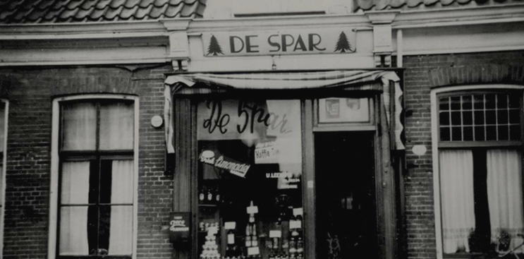
Surprisingly, we discovered that SPAR is an old player in the retail industry with international operations since the last 86years. The company started out being called DESPAR which is a Dutch acronym for Door Eendrachtag Samenwerken Profiteren Allen Regelmatig (In English meaning – “All benefits from joint co-operation”). This interpretation gives a summary of the SPAR brand story.
SPAR is a multinational firm which manages several individual retail stores and partners doing business under the SPAR brand name. It was founded in Netherlands by Adriaan van Well in 1932 on the premise that when marketers do business as individual entities they yield lesser results as compared to several individual wholesalers and retailers coming together in partnership to form a huge market network. They meet a wide range of consumers’ needs making very huge impacts by leveraging on the ensuing large customer base.
In 2009, SPAR International gave license to Artee Industries Limited to operate SPAR in Nigeria. SPAR stores in Nigeria are built on hypermarket retail format. Presently, SPAR is operating 10 stores across Port Harcourt, Abuja, Lagos, and Calabar accruing more than 34,000m2 of retail space, hence making it the largest chain of retail stores in Nigeria. They offer an ample variety of products in the class of Grocery, Fruits & Vegetables, Bakery, Butchery, Hot Meals, Wine & Spirits, Fast Moving Consumer Goods, Consumer Electronics, Small Home Appliances, Laptops & Tablets, Mobile Phones, Perfumes, Watches and Jewelry.
Amazingly, even when most persons aren’t aware of the business and historical facts surrounding this retail brand, they could readily recognize the brand’s logo on any item and on Ads most especially due to its constant appearance on the brands packaging materials. SPAR’s visual identity as concerns its logo, has over the years communicated the brand’s story, essence, and culture as it is proven through the successes recorded by the brand in the business world. Currently SPAR which started as one single Dutch store has over 12,770 stores in over 45 countries on four continents; meeting the needs of over 13.5 million consumers every day. Join us as we delve into the brand story of its simple but unique logo.
HISTORY OF THE LOGO
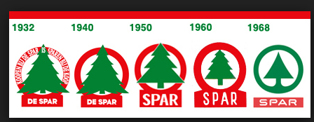
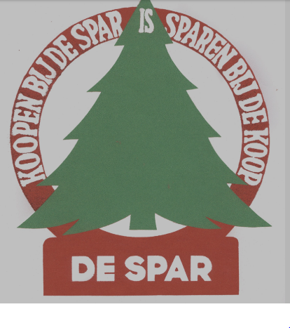
In 1932, at the inception of the organization, the symbol chosen to represent the brand and give it an identity in the hearts of its customers was the Christmas tree. Amazingly, the brands name “DE SPAR” means “The Fir” also known as the Christmas fir tree. The logo had the fir tree symbol centered boldly and the brand’s name written at its base. The debut logo also had a Dutch inscription “Koopen bijde De Spar is Sparen Bijde koop” meaning buying at the De spar is saving on buying. Eight years later, the Dutch inscription taken off but the rest of the design left as it were. To emphasize consistency in branding and identity, SPAR maintained the same logo design in all its stores worldwide.
In the late 1940s, the brands name was abbreviated from DESPAR to SPAR and so the existing logo was modified to capture this change. As years went by, other modifications in the design was made. This time, the fir tree symbol was resized to fit within the red circular band.
Increasing its Europe presence and entering into Africa and Asia, triggered the need for a more sophisticated logo to enhance its marketing strategy. So in 1968, the logo which is currently in use and can be seen in SPAR’s outlets and packaging material was introduced. The fir tree symbol had a refined outlook like an arrowhead enclosed within a green circular band and also having the SPAR element scripted within a red block base.
LOGO SPECIFICATIONS
Logo Description
SPAR runs its business under four (4) store formats – SPAR, SPAR Express, EUROSPAR supermarket and INTERSPAR Hypermarket – and each of these store formats has its brand logo.

The SPAR Express logo communicates the identity of the SPAR Express store format which is to provide service and products to on-the-go shoppers in petrol stations, airports, railways and city centres. It has the smallest sales area.

The SPAR logo has the original design format and thus represents the parent brand. It is used in communications describing the retail firm as an organization having several partners. This brand comes after the Express logo in sales area and accommodates products that satisfy consumers’ needs on daily basis.
EUROSPAR logo describes the EUROSPAR Supermarket brand which has a larger sales area than the earlier mentioned store formats. This Supermarket format is designed to cover items and purchases of consumers on weekly basis and thus caters for more needs than the earlier mentioned brands.

INTERSPAR Hypermarket logo represents SPARs biggest store format – the Hypermarket brand. This brand has the largest sales area of more than 3000m2. It was established to meet a wider range of consumer’s needs than all its other store formats. Its purpose is for it to be a one-stop shop for consumers.

Logotype colour specification
An excerpt from the Spars online logo manual says:
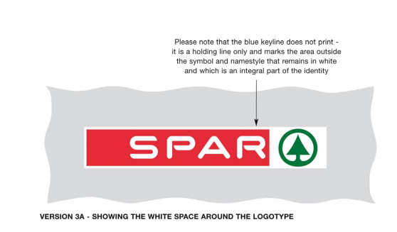
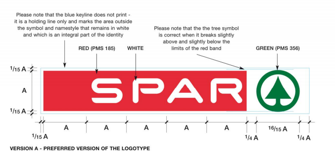
“The area outside the symbol and the name style is an integral part of SPAR’s identity and should always remain white.
The logotype is printed in two colours on a white background and it is critical to SPAR’s identity that the colours are interpreted correctly and consistently. The green symbol is (Pantone Matching System) 356 while the red name carrier PMS 185.
Also, the identity should always be printed onto a white background”.
LOGO MEANING
Symbol meaning
The logo encapsulates the symbol of fir tree which stands for ‘SPAR” in Dutch. The fir is popular for its Christmas tree species. Christmas is a festive season of celebration, shopping and gift unraveling. Hence, the fir Christmas tree symbolizes same. We also know that SPAR is an abbreviated Dutch acronym for DESPAR meaning “All benefit from joint co-operation” and this describes the SPAR concept.
The fir symbol also takes the shape of an arrow head signifying force, direction, movement, power and direction, speed, accelerating growth rates and expansion of SPAR in the retail industry.
Colours meaning
The logo has both Red and Green colours. The green colour which is the colour of the fir tree signifies; life, growth of the business, freshness of its food retail products and services. Red has always been an attractive and captivating colour. It represents excitement, passion, energy and has a strong effect on human metabolism and stimulates appetite hence drawing customers to the brand.
Written By Rejoice Emmanuel
Do you need an expressive logo for your brand? We would love to work with you. Shoot an email to wecare@mapemond.com

