LOGO UNRAVEL: THE STORY BEHIND THE NEW MAPEMOND LOGO
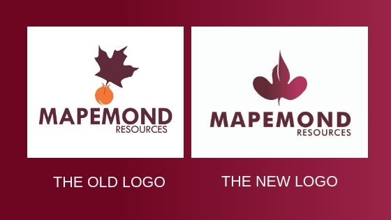
This is the maiden edition of our new blog series ‘Logo Unravel’ and we are excited to present to the world our own logo which we recently revamped. It’s been ten years since our voyage as a firm began and as part of the memories we are creating for ourselves, we decided to revamp our logo to reflect our unfolding story and new horizons. Our new logo consists of three distinctive elements all melded together to create a single icon which accurately gives a visual expression to who we are and what we are about as a brand.
THE LOGO ELEMENTS
Each element represents an aspect of our journey so far and in fusion, all three elements depict a brand that is ever growing, creative and dedicated to helping brands become profitable, remarkable and sustainable.
Element 1: The Maple Leaf (We Appreciate Beauty, Life, Continuous Growth)
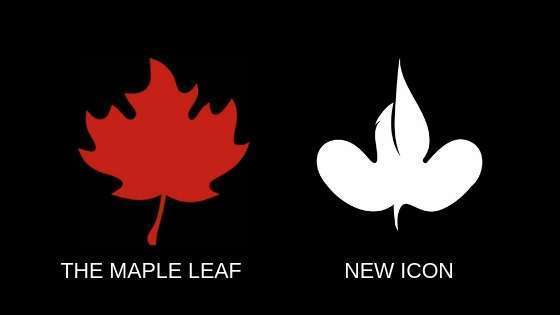
Being part of the old logo, the Maple Leaf is the oldest element in the renewed logo. It is common knowledge that leaves generally represent life. For us, the maple leaf symbolizes our core essence – breathing life to brands and sustaining it, and by so doing, shining our light so brands and people can find their path.
The leaf represents the source from where we draw all our inspiration, where all our passion and desire for continous growth comes from. It is also a symbolic reminder of our origin, our Founder, Maple Dappa.
Element 2: The Boat (We Are Way Finders)
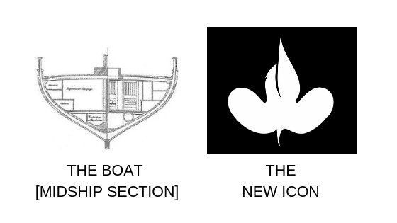
The boat is for sea transportion as commonly known. For our brand, this element simply represents us as a vessel that convey brands from where they are to where they should be – a place of bloom. We act as their wayfinders, ensuring that the entire structuring of their brand is done right so that even after we are done pointing them in the right direction, setting the most vital parts (mission, vision, values, internal & external branding) in place, they will have a solid foundation to continually build upon.
Building a solid brand is like going on a journey and we are here to make sure that you do it right and that your journey is an incredible one that leads to longlasting greatness. All of these we do, not forgetting that sometimes the sea could be rough.
Element 3: The Sail (Our Willingness To Explore)
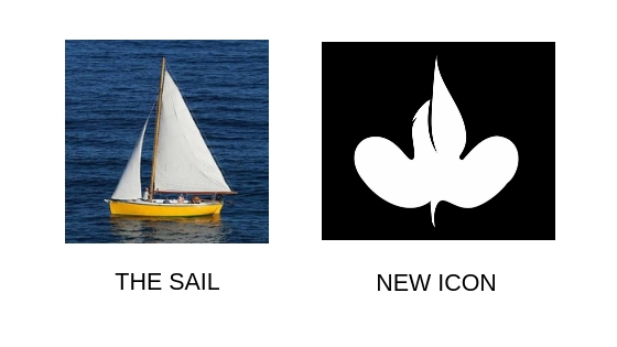
We are proudly adventurous. As a part of our journey and adventure, we dare to take on the journey of other brands, fusing ourselves into each brand, tasting all the saltiness of the ocean so that we can know the best way and direction to steer their boat as their wayfinder, and set it on course to brand success.
The sail is a symbol of our creativity and style; we are never afraid to do it differently but we always do it with creative intelligence. The sail also symbolizes our affinity with fun even when risk beckons.
Together, these elements symbolize a brand that is ever growing, creative and a strong force that dedicate themselves to creating authentic brands that will stand the test of time and be globally recognized.
OUR COLOURS
Colours make things more inviting, giving life and beauty to everything. And at Mapemond, we love colours and consider them the custodian of beauty. The colours Burgundy, Maroon, Black, Grey, Yellow and White are our brand colours and they give expression to our mood and style. They give us a face, an identity unique to us, making it easy for us to standout.
1. Burgundy
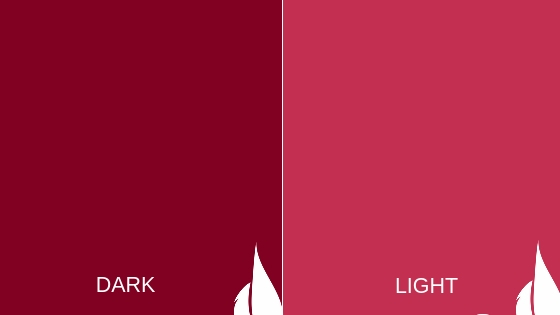
Burgundy is a mixture of brown and red with a purple tint. The colour is often associated with class, power or sophistication which we have traits of, but our choice of burgundy is a reflection of our disposition of being ambitious and classy without being too loud or bullish.
2. Maroon

Maroon is a duskier mixture of brown and red without the purple tint that burgundy has. The colour is usually used to represent confidence, excitement, ambition, strength and courage. While all of these apply to us as a brand, our choice of Maroon is to express our characteristics of creative thoughts, warmth and beauty – we love to think in a creative manner, make people feel warm around us, and make beautiful things consistently.
3. Yellow
Yellow is said to be the brightest colour of the visible spectrum and the most noticeable of all colours by the human eye. It could mean happiness, optimism, or even high energy and these are all traits our brand possess, but more than that, the colour yellow represents the rising of the sun which symbolizes a new day, renewed hope, and cheerfulness. Our brand doesn’t have it smooth all the time, there are down moments and even failures, but we never fail to keep our eyes fixated on the brighter side and what is possible.
4. Black

The colour black is symbolical of our strength and origin as an African brand. It is also an expression of our authority in the field of brand engineering as well as our quality of elegance and prestige.
5. Grey

Grey is a neutral colour that usually takes on different meanings depending on the situation and immediate application, but to us it is an expression of our adaptability as we get involved with diverse brands with unique and peculiar circumstances. The colour is also a depiction of our commitment to always find balance, stay professional and modest. It is an assurance to our team and clients that they are in the best hands.
6. White

White connotes quite a lot because it is the lightest of colours. It could mean integrity, simplicity, new beginning, independence, neutrality and so on, but white expresses two things about us – openness and trust. From the relationship in our team to the relationship with clients, we do our best to keep an open mind and also work hard to be trustworthy.
OUR FONTS
In all our documentations and official presentations, we stick with specific fonts such as;
- FLEXO
- FUTURA MD BT
- GENGHIS KHAN MED
- MISO
Our revamped logo has infused new energy to the team, given us a clearer sight of the new horizons and we are excited about what the years ahead hold for us as we sail on.
Does your logo and visual identity tell your story? We can work with you to get it right. Send us an email via wecare@mapemond.com

