LOGO UNRAVEL: THE NEW ACCESS BANK

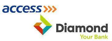
After several months of deliberations and restructuring, the long awaited merger between Access Bank and Diamond Bank finally came to an official conclusion on April 1st, 2019. This merger is by far one of the most remarkable mergers in Nigeria’s banking history and has placed Access Bank as the largest retail bank in Africa by customer base. Access Bank stated that the new brand which is recorded to have over 27000 staff spread across 592 branches in 12 countries distributed in 3 continents with over 29 million customers, has always been part of its vision.
Following the successful merger between the banks, the values of the both Access Bank and Diamond Bank were combined to create a new visual identity. The CEO, Herbert Wigwe, emphasised that the brand’s new identity is built on the long lasting philosophy with the vision to be the world’s most respected African bank.

LOGO MEANING
Explaining the inspiration behind the new logo, it was revealed that the emblem is a fusion of both banks’ corporate values. While Access Bank has been attested for being fast, recognised and trusted globally, Diamond Bank is known for its youthfulness, vibrancy and humanness. In their words;
“The new visual identity fuses together the best of Access Bank and Diamond Bank. It builds on the layers of meaning that were built into two iconic brands. Diamond bank’s was youthful, vibrant, and human. Access Banks’s was trusted, global, and fast. Bringing them together to capture the strength created through the merger meant drawing from the essence of each logo but refreshing them to create a sense of energy and forward momentum”
Despite being a blend of both banks, the new brand is designed to have refreshing attributes of its own. “Bringing them together to capture the strength created through the merger meant drawing from the essence of each logo but refreshing them to create a sense of energy and forward momentum.”
LOGO ELEMENT
In the new logo, the diamond shape was retained but with new features added to it. The diamond shape is embedded in three chevrons that is maze-like which is meant to give direction or access to customers. “The diamond shape is fused into the three chevrons, which radiate in all directions to create layers around a core.”
LOGO COLOUR
The new logo is designed in two colours- a dominance of the well-known orange colour which will be used in corporate application in order to retain the sense of familiarity among Access Bank’s customers while the diamond colour palette will be used in its retail application to ensure continuity for retail customers.
“The retention of the access typeface, colour and font is complemented by the orange logo, which draws from the colour palettes of both banks”.
SLOGAN AND IMPACT
Accompanied with the new logo is the new tag line, “Access. More than Banking”. They refer this slogan as their philosophy and a promise they will work to keep.
Having being in the picture for over two decades, Access Bank is confident about the impact they’ve made so far. Their brand’s history serves as an assurance to both Access and Diamond Bank’s customers that they would be able to keep and succeed their promise. Narrating their impact journey, they said;
“Almost 20 years ago Access Bank set out to change the face of banking in Nigeria. Its goal was to lift the continent of Africa through what it called sustainable banking, showing individuals and businesses across the country that ethical business was good business.
“Providing African businesses with access to intra Africa trade and global markets. Giving budding entrepreneurs the tools to build a business.
“Offering families the opportunity to realise their dreams. Across the country, another entrepreneur was also building a bank, with a dream that went beyond banking.”
Written by Jennifer Chioma Amadi
Are you in need of a logo? We design the best! Send us an email at wecare@mapemond.com
Do Business Better!

