LOGO UNRAVEL: NESTLE’S NEST OF NOURISHMENT
Symbols have long been a great way for brands to communicate their values and generally express what they do. Some brands have become widely known for their distinctive logos. For Nestle, the peculiar nest and birds’ symbol has formed its identity.

The Nestle logo is one of the few logos that never cease to make a statement about their brand to everyone who encounters it. It is regarded as a ground-breaking logo that has set the pace for other brands since its creation.
Let’s delve into its history to see the logo transformation.
LOGO HISTORY AND EVOLUTION
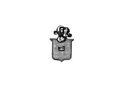
The premier logo that was used in 1868 was simply the Nestlé’s family coat of arms. The symbol was a bird on a nest, placed inside a shield shape. Based on the type of brand Nestle wanted to build, this logo was not suitable for it. The emblem did not communicate the company’s vision in any way and that led to the need for a better logo.
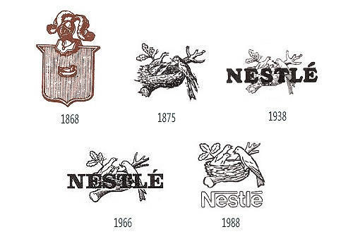
In 1875, Nestlé’s founder, Henri Nestlé drew inspiration from his family’s coat of arms to create a fresh logo for the brand. This new logo featured three birds in a nest, being fed by their mother. The symbol was a visual connection between the family name, Nestlé, which is interpreted as nest in German and the company’s infant cereal products for nourishment. With this move, Nestlé was rebranded to symbolise a safe nest for nourishment.
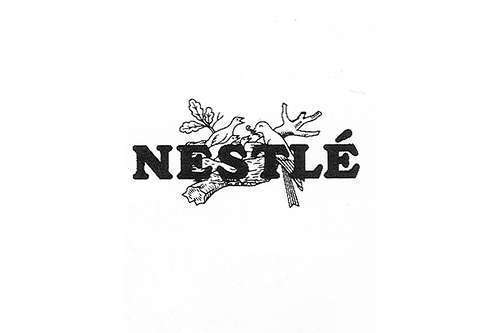
1938 came with a new swing of change; Nestle combined the lettering and logo to create a new identity for the brand. This unique mark unified all Nestlé products.
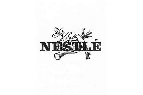
The company’s trademark was modified in 1966 during the celebration of the company’s 100th anniversary.
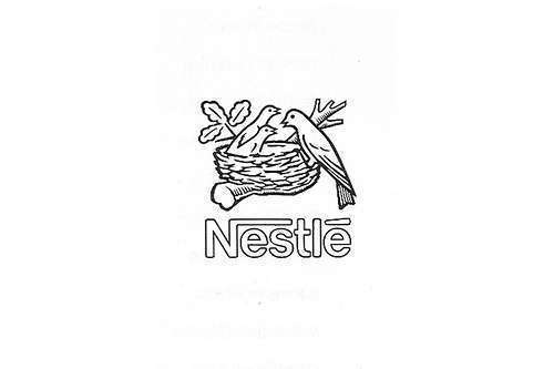
In 1988 one of the young birds, as well as the worm in their mother’s beak were removed giving the brand a new identity, This was to communicate that the subsidiaries were given homogenized names in combination with “Nestle” which then became a strategic umbrella trademark.
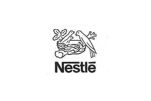
In 1995, the logo was simplified again and the four categories of products, milk product, ice cream, confectionery and baby milk were all given specific Nestle lettering.
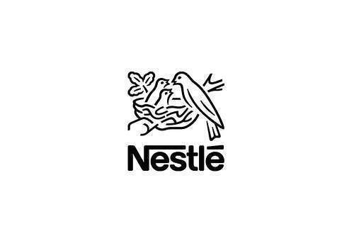
The company made some modifications in the logotype in 2015. The logo was made bolder with other slight changes to the sketch. According to the company, the new Nestle symbol was designed to appear better on digital devices like smartphones.
LOGO FONT

Nestlé’s wordmark is written with sans-serif type with much emphasis on the letter “N”.
LOGO COLOUR
Initially brown-and-white were the only colours used to design the original logo but over time, colour schemes like grey-and-white or black-and-white are now being used.
In years to come, consumers all over the world will always remember Nestlé’s emblem with a sense of familiarity and fondness knowing its products never failed to meet their expectation thereby reflecting its brand value, “Good Food, Good Life”. This is the real definition of logo impact.
Written by Jennifer Chioma Amadi
Do you need a symbolic logo for your brand? Contact us today at wecare@mapemond.com
DO BUSINESS BETTER!

