
LOGO UNRAVEL: THE TOYOTA IDENTITY
One of the famous and oldest automobile brands in the world which stands out for the quality, durable and reliable vehicles they create is Toyota. Established in 1933 by the Toyoda family as a subsidiary of the Toyoda Automatic Loom works, they started out producing automatic loom works and textiles before diversifying into automobile production with the production of the model AA passenger car in 1936. Headquartered in Toyota city, Aichi Japan, earliest productions were directed by the founder’s son, Kiichiro Toyoda and the company was named after the family’s name – TOYODA.
However, it was later renamed TOYOTA in 1936 after a competition which had 27,000 design entries was held in that effect. The design entry bearing the Toyota name was chosen and the TOYOTA brand incorporated as the company’s name. This was because whilst Toyoda took 10 Japanese strokes to write, Toyota took 8 strokes which in Japanese culture signify luck and good fortune.
Remarkably, the Toyota brand was introduced into the Nigerian automobile market 32 years after it was founded through various distributing outlets. Later on Toyota (Nigeria) Limited was incorporated as the sole distributor of the Toyota Motor Corporation.
The Toyota brand has over the years endeared themselves to the heart of their customers especially through its visual identity system specifically the well-known Toyota 3-ellipses logo. This has contributed greatly to the successes recorded by the Toyota brand. As little children we could remember playing with this emblem on our parents Toyota cars. This article aims to unravel the wonder behind this globally recognized logo.
HISTORY OF THE LOGO
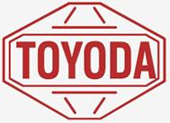
The debut logo was designed in 1935 bearing the company’s name as at the time – TOYODA. It had the shape of an octagon with the TOYODA inscribed in bold uppercase red font. This was seen on the AA model car and G1 truck produced in 1936.
With the renaming of its name from TOYODA to TOYOTA, a new logo was designed to capture this effect. However, this new design had TOYOTA transcribed into Japanese language and centered in a red circular background.

After about 10 years later, the logo design was further re-designed. This time, it had the brand name inscribed in English language; scripted similarly with “Times New Roman” in a bold uppercase black font colour.

Later on, the succeeding logo font was modified using the “Bold Toyota Type” font and inscribed in black font colour.

This font colour was later changed into an attractive red colour which is today known as the Toyota Red. This had a captivating feel, attracting more customers to the brand.

Conclusively, the well-known 3-ellipes logo was introduced at the 50th anniversary of Toyota Motors Corporation on the 2nd of October, 1989. The previous red logo element was added to the 3-ellipses emblem forming one of the most popular automobile logo in the world today seen on all Toyota vehicles. Subsequent years have seen various modifications in typography, colour, staging platform and visual dimensions being made to the Toyota logo.
As part of showing their value and enthusiasm in promoting their visibility and acceptance, Toyota has a website exclusively dedicated to provide detailed information on their Visual Identity System (VIS) covering these six core elements – logos, tagline, typography, photography styles, colour palette and design layouts. Certainly, their visual identity matters a great to them, like it should be for every other brand.

TOYOTA LOGO SPECIFICATIONS
Logo Description
Toyota Motors Corporation is visually identified using any of these 3 logo types: (i) the Toyota Brand logo (ii) the Let’s Go Places logo and (iii) the Vehicle logo.

The Brand logo is used to represent the parent brand and is also used when more than one Toyota product is advertised. In addition, it appears where the slogan (tagline) is used as a headline in a publication. Still, it is not used were the vehicle logo appears.
The vehicle logo is used when marketing a particular Toyota vehicle. Some of Toyota’s vehicle brand includes; Corolla, Camry, Sienna, TACOMA, RAV4, Highlander, 4RUNNER, SEQUOIA, TUNDRA, C-HR, Land Cruiser, Avalon etc. This logo however, is not used alongside other logos or elements.
The Let’s Go Places Logo conveys the brand essence and culture. It is not used without the staging platform when used as a logo. Also, it comes in three forms; the horizontal stacked, horizontal and vertical.

Logo Elements
Toyota logos comprises of 3 elements: (i) the typography i.e. font size, font style etc., (ii) the Toyota symbol and (iii) the staging platform which could also be called the background fill.
Size measurements
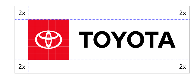
The minimum size that the Toyota logo can be reduced to – in both Print and Digital – is 9mm and 24 pixels respectively. This also tells the minimum height that the staging platform can be. In addition, on publications, all logo designs carry a little clear space around them. This clear space is measured in X unit. This is derived by dividing the staging platform into 6 rows and 6 columns. Each cell represents X unit. Two units (2X) of this measurement tell the amount of space that is left both horizontally and vertically around the logo design in a communication.
Typography
Toyota’s logo font style is the ‘Bold Toyota type font’. The Font colour could be black or red depending on the background of the publication whilst size and space dimensions are stipulated in Toyota’s VIS manual.
Colour
When the staging platform is in Toyota Red and the typography in black, the logo is placed on a light or white background while when the staging platform is on a dark publication background, the typography becomes white but the staging platform remains red. The Toyota VIS makes provisions for 1-colour designs with no other colours apart from black, red and white.
Logo Colour Palette
Toyota colour palette comprises of Red, White and Black with the primary colour as Red. Red represents energy, visibility, passion, excitement and the Toyota taste for adventure. White stands for clarity showing Toyota’s sincerity in creating an impressionable product to its customers.
MEANING OF THE LOGO
The Logo Symbol
According to online sources, the two inner intercepting ellipses in the Toyota symbol represents the unification of the hearts of Toyota customers with the heart of Toyota products while the largest oval encapsulating the inner ellipses, represents the world embracing Toyota. The background space in the Toyota symbol spells Toyota’s technological advancement and the boundless opportunities ahead of them.
Also, in another explanation, the two inner ovals that overlap to form a “T” stand for Toyota and the centered oval forms the shape of a steering wheel which represents the Toyota vehicle itself.
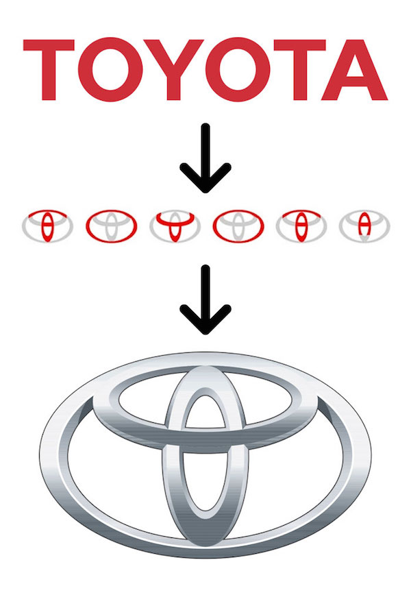
Furthermore, recent discoveries shows that upon a closer look at the Toyota 3-ellipses symbol, it is seen that all the letters that spell the word TOYOTA are found in it.
INCORRECT USE OF TOYOTA LOGO
In order to maintain consistency and encourage sustained brand awareness, Toyota advocates for the correct use of their logos on all communication platforms. Some possible misuse of Toyota logos are:
- Using the 3-D logo in brand communications
- Changing the logo colour
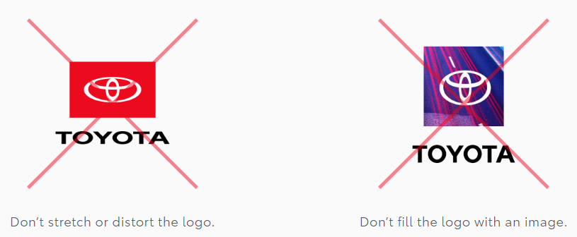
- Distorting the shape of the logo shape
- Filling up the staging platform with an image
- Adding a shadow to the logo
- Altering the logo artwork
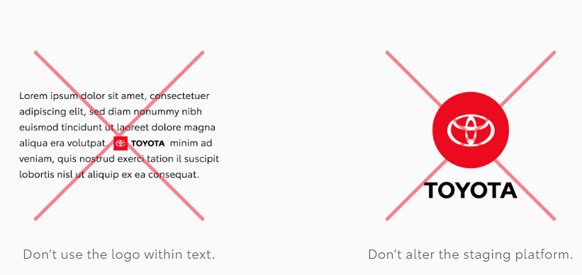
- Changing the shape of the staging platform
- Using the logo within text
- Changing the logo typography style
- Changing the type size or colour of the tagline.
There is obviously more to a logo beyond – it preserves a brand’s history, tells its story, and expresses its culture in ways unique to the brand alone. We hope you found this insightful for your own brand?
Written by Rejoice Emmanuel
Do you need an expressive logo for your brand? We would love to work with you. Shoot an email to wecare@mapemond.com

