
LOGO UNRAVEL: THE UPS BRONZE SHIELD
Universal Parcel Service is unarguably one of the world’s most remarkable package delivery company. Asides being one of the oldest package delivery and supply chain management companies known all over the world, its logo has continued to give the brand a bold and unconquerable face.
Though UPS has always kept its logo simple, it has never fallen short of communicating the company’s values to the customers. From the delivery trucks to each parcel delivered, the UPS logo leaves its stamp in the memories of people. The logo has added to the global recognition the brand enjoys.
LOGO HISTORY
The UPS logo has so far experienced four transformations since it was designed over a century ago. At every point in time, as the company evolved with different market strategies, it ensured the logo evolved with it.
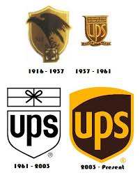
Logo transition…
The first UPS logo was created the same period in 1916 when the company was established. The logo had distinguishing features such as an eagle carrying a parcel with its claws and the famous bronze shield. To further define the brand’s values, the words ‘Safe, Swift, Sure’ were written on the sides of the package. This logo symbolized the brand’s strength as regards its service. In no time, it became the company’s identity.
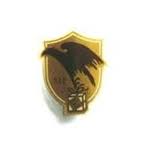
First logo in 1916
Even though the first logo was remarkable, UPS needed something that would align with its growth. With this in mind, the company redesigned its logo in 1937 to match the company’s new goal. This logo has the letter UPS written on it but the bronze shield was retained. Following this change, the company’s slogan was changed to “The Delivery System for Stores of Quality” in order to get the target customers.
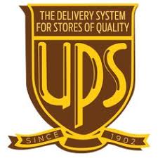
Second UPS logo
In 1961, a new logo emerged which was designed by Paul Rand. The logo had a package tied with a string above the UPS shield. The aim of the logo was to highlight that the company’s core service was package delivery.
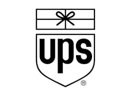
Third UPS logo
The logo was reviewed again in 2003 and this time the shield was recreated to give a pleasant look. The new logo was designed with the colour brown and was accompanied with a new slogan, “What can brown do for you?”
This logo was designed by FutureBrand, a brand consulting firm. The new logo was used on delivery trucks and had a new font called UPS Sans.
Fourth UPS logo
LOGO COLOURS
Brown has remained the colour that has distinguished the company since 1916. For UPS, the brown colour means elegance and professionalism, which also hides dirt on uniforms and delivery vehicles. UPS uses two shades of brown that are their registered trademarks. They are both used for their vehicles or clothing.
Though there has been some proposals and research to change their famous chocolate brown colour, no other colour has been able to meet the company’s standard. Rather than change their primary colour, chocolate brown, the company adds brighter colours to it like red, blue and green to form a sort of colour palette. While they add these other colours, they also try to maintain the brand’s original identity.
The simplicity of the UPS logo has beaten the idea of sophistication. While some brands seek to create abstract designs, UPS focused more on the message each logo passed to their potential clients. It has remained consistent with the shield identity that has also increased its popularity. With its simple but yet powerful logo, UPS continues to stand out.
Written by Jennifer Chioma Amadi
Are you in need of a logo that represents your brand? We are here to help. Send us an email at wecare@mapemond.com
DO BUSINESS BETTER!

